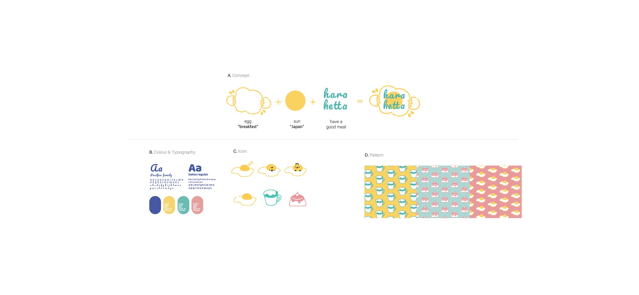
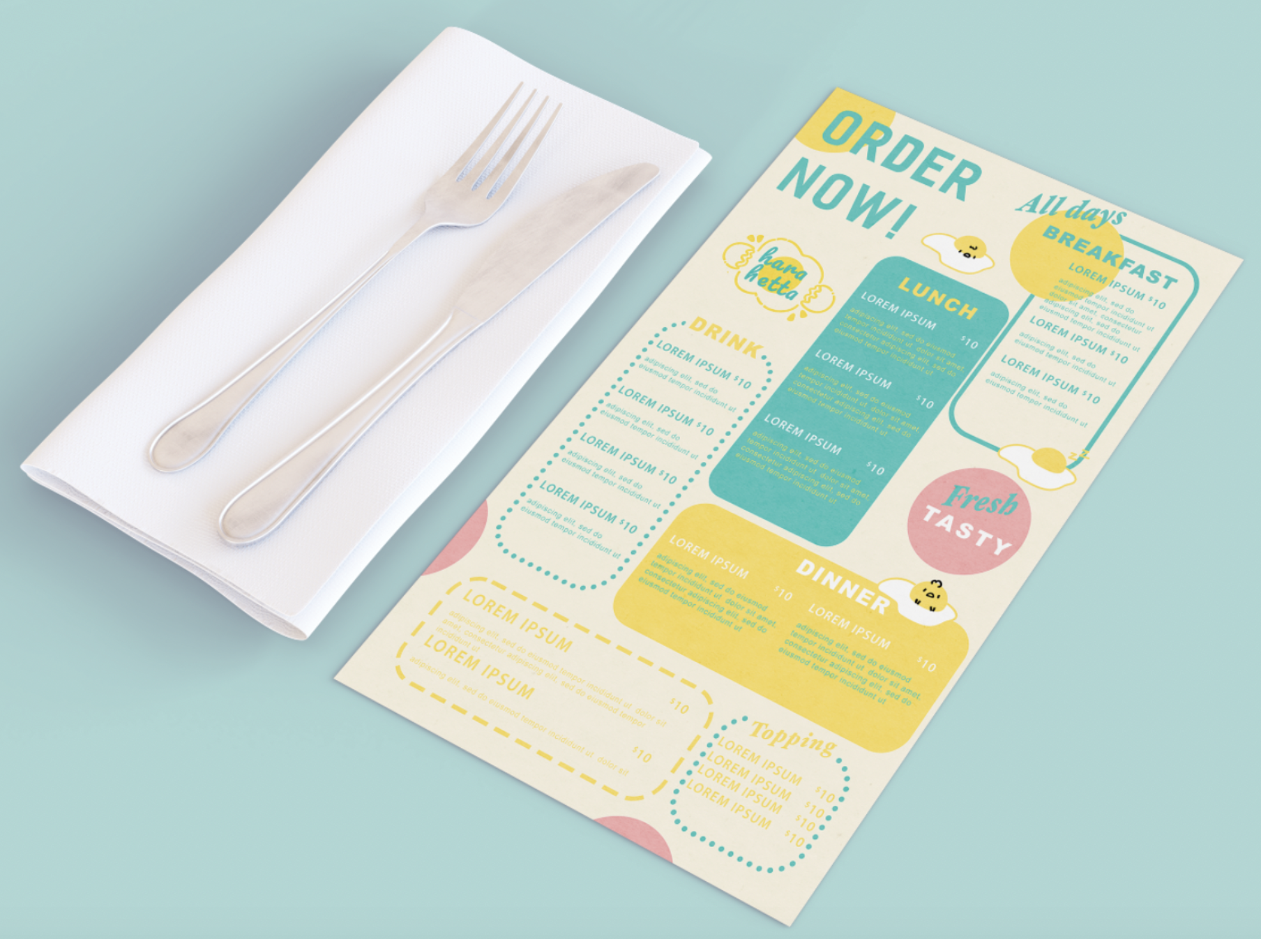
Hara Hetta is a Japanese restaurant based in Vietnam. They serve breakfast all day but offer lunch and dinner as well. Their target customers are children and teenagers from 6 to 20. I design a logo to represent their restaurant and branding elements to use for all platforms: packaging, menu, business card, uniform and website. My design inspiration comes from a fried egg which is a universally popular breakfast dish. Utilizing the given color palette I chose the primary color to be bright yellow since it stimulates your appetite and is also associated with happiness.